

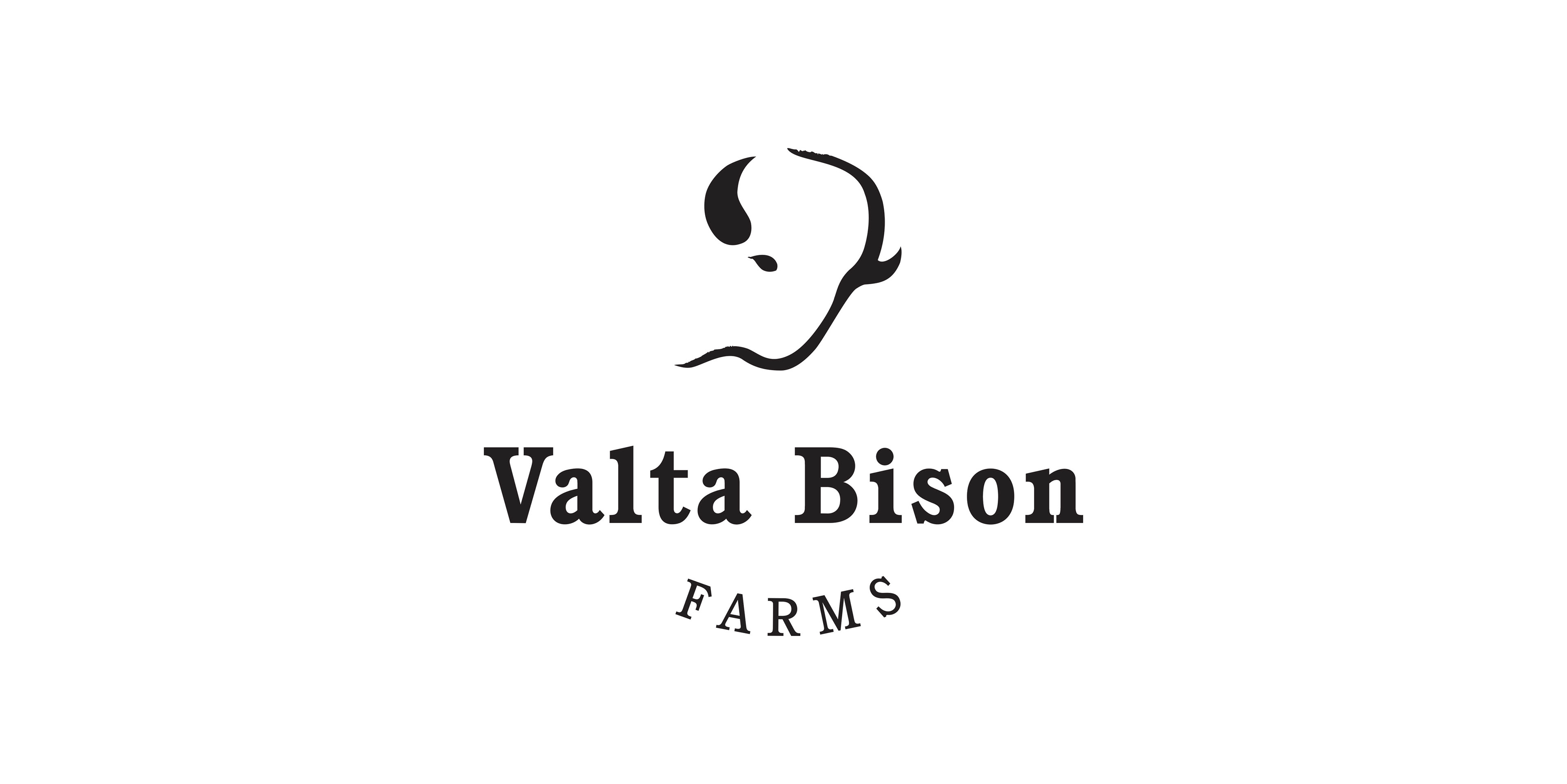
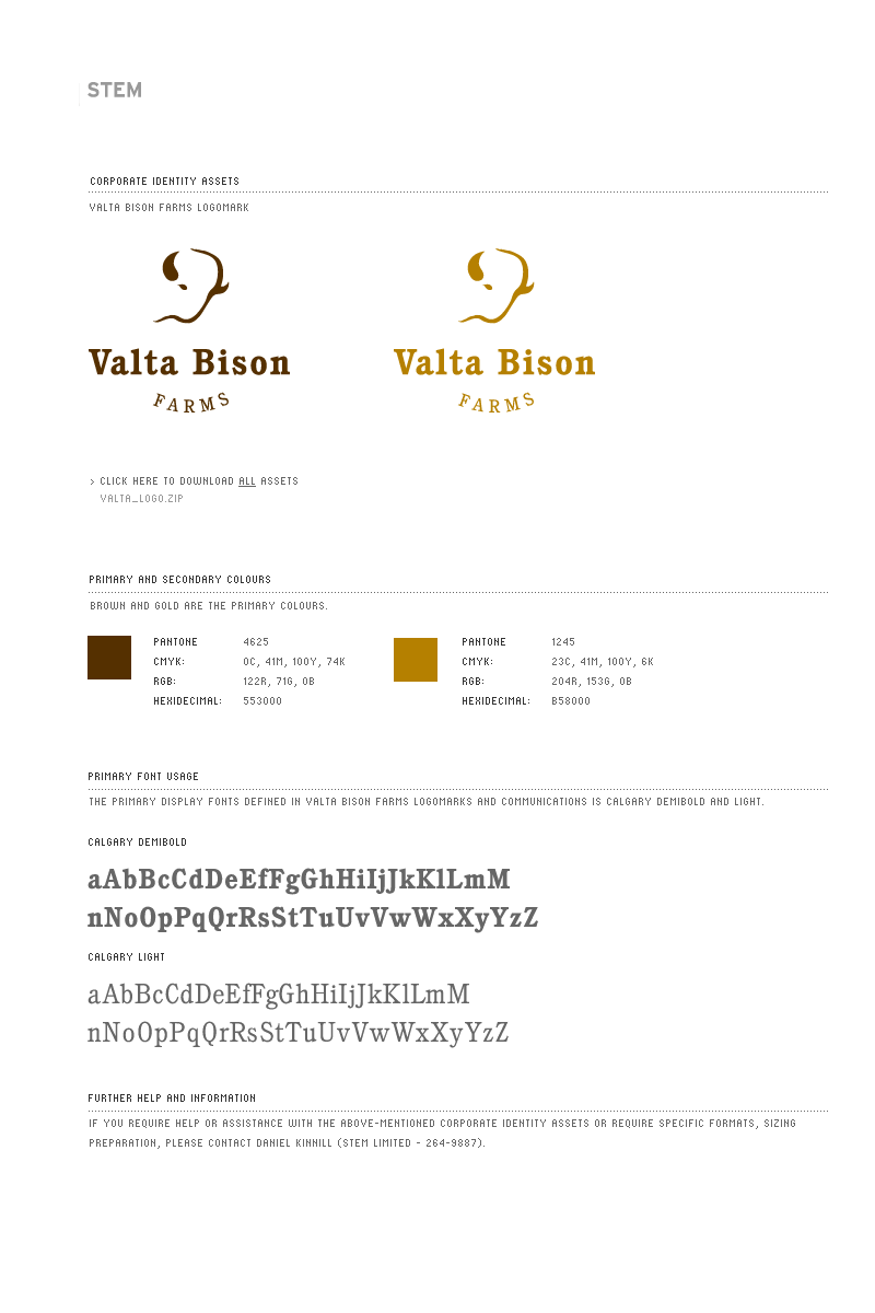
Logo redesign and implementation of a brand style guide for a local Alberta bison farmer. The redesign involved cleaning up the logo's bison illustration, choosing a new font that best fit the farm's values and image as well as ensuring the overall logo looked inviting and welcoming.
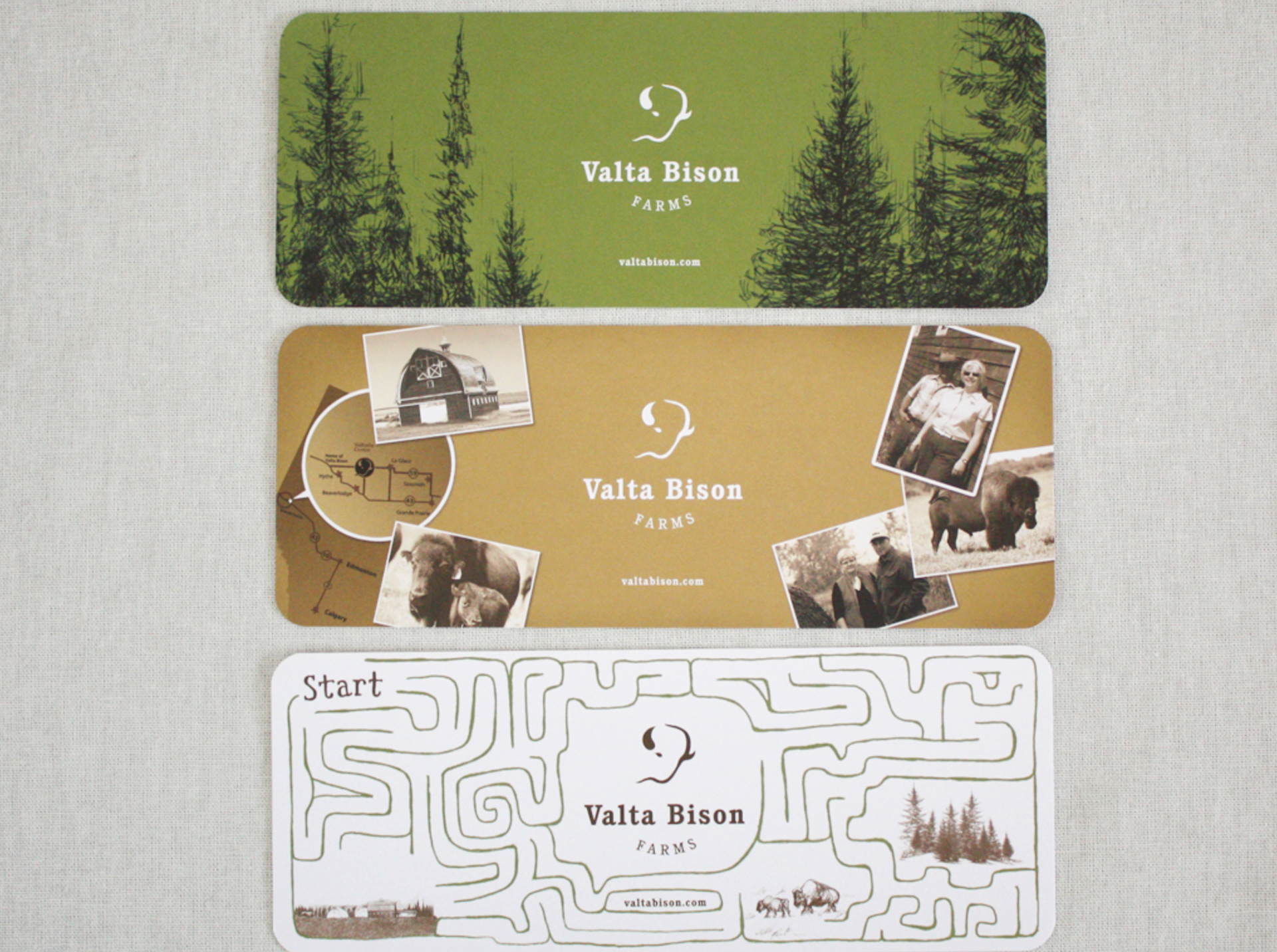
The new branding assets and colour palette also allowed for a more cohesive brand for the farm in their print collateral, business cards and marketing. All design was done at STEM Communication Ltd.