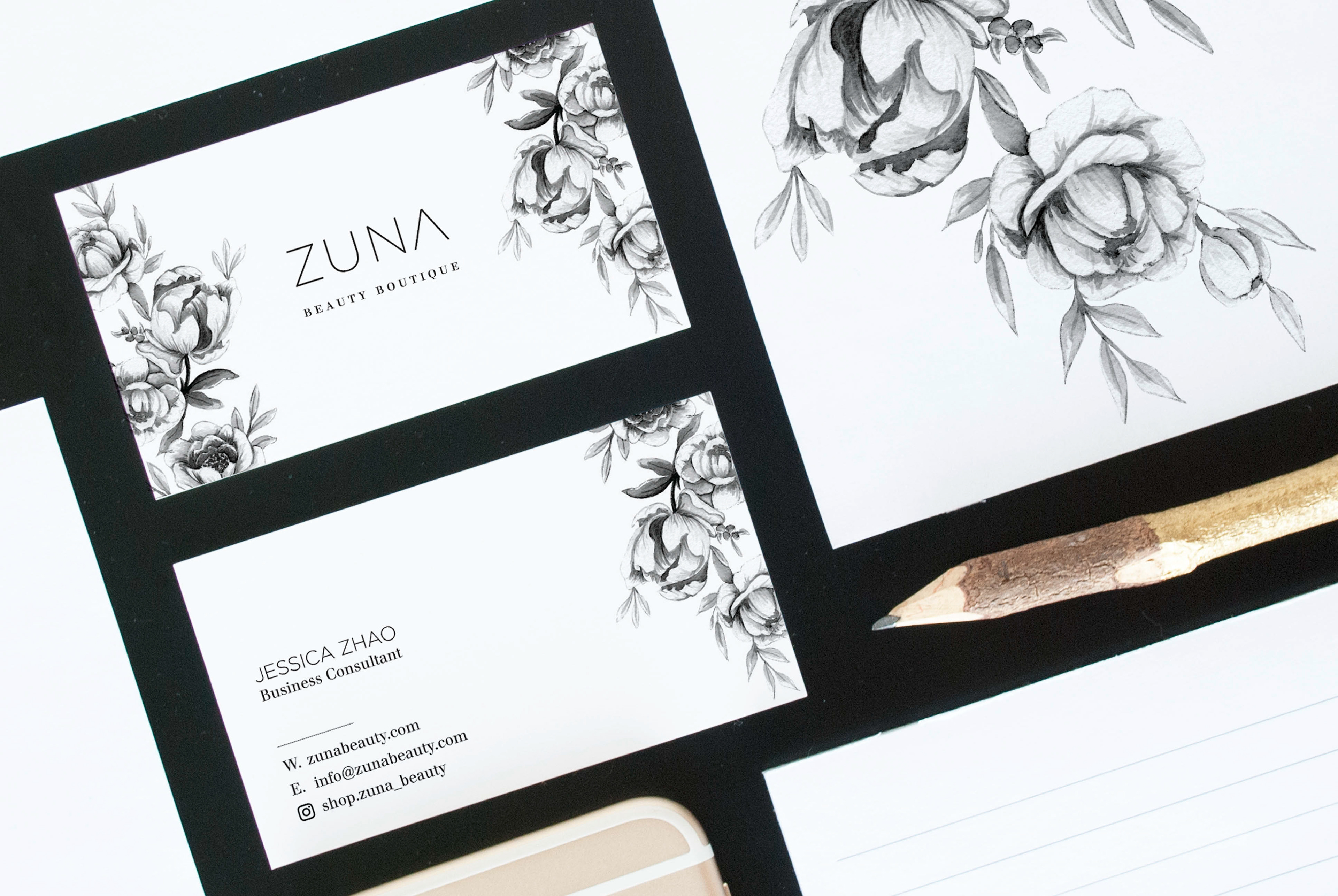

Zuna is a modern boutique that sells curated luxury beauty accessories. The business was looking for a logo that would represent their high quality aesthetics, yet still be modern and minimal. The logo needed to stand out on its own and be able to grow when the product lines expanded in the future and should feel modern and classic with a feminine touch.
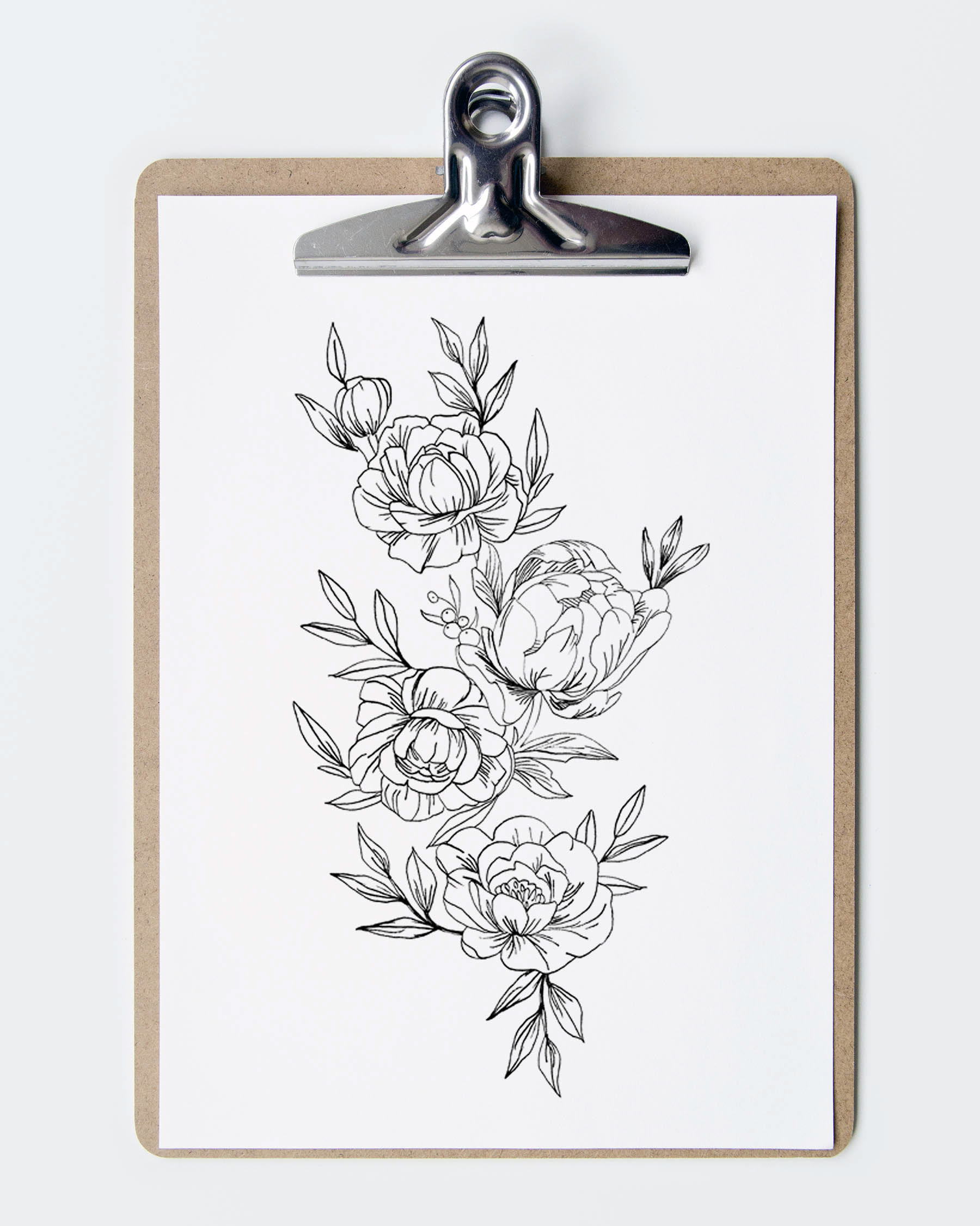
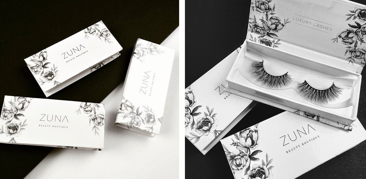
The logo itself was conceptualized to be able to work on its own as a word mark or with other secondary elements. The choice of a sans serif font with very clean lines help define the brand's modern look. The secondary element was to incorporate a feminine feel to the overall brand. This involved developing a custom water colour pattern of water peonies in black and white. It could be used on its own for other packaging ideas or in this instance, the company's business card and retail packaging.
The brand and identity is black and white to allow the brand to have a classic and clean aesthetic. This will also provide a neutrality to the brand's product lines, in the event new collections are added, other tertiary colours would be used to define each collection.