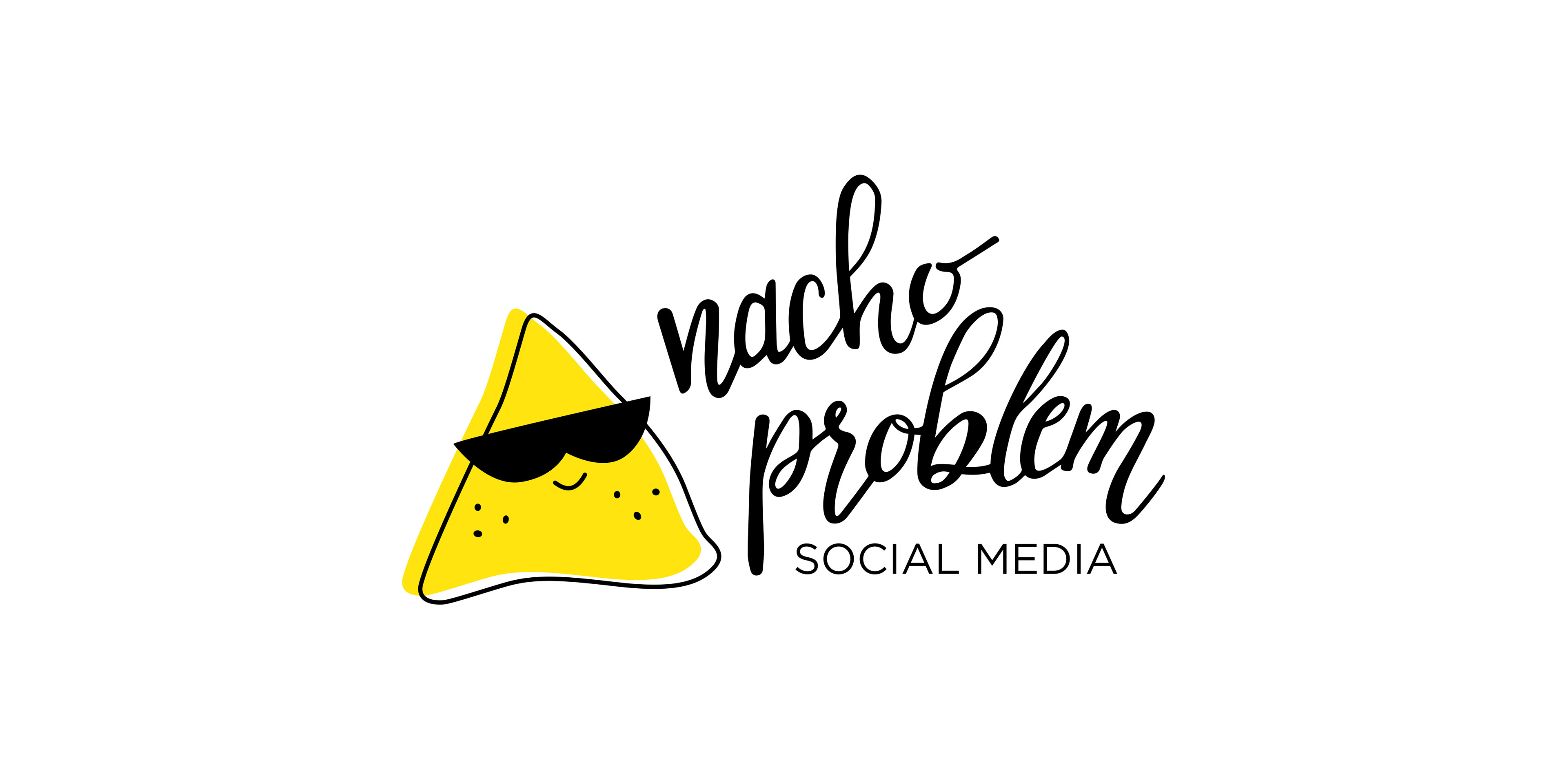
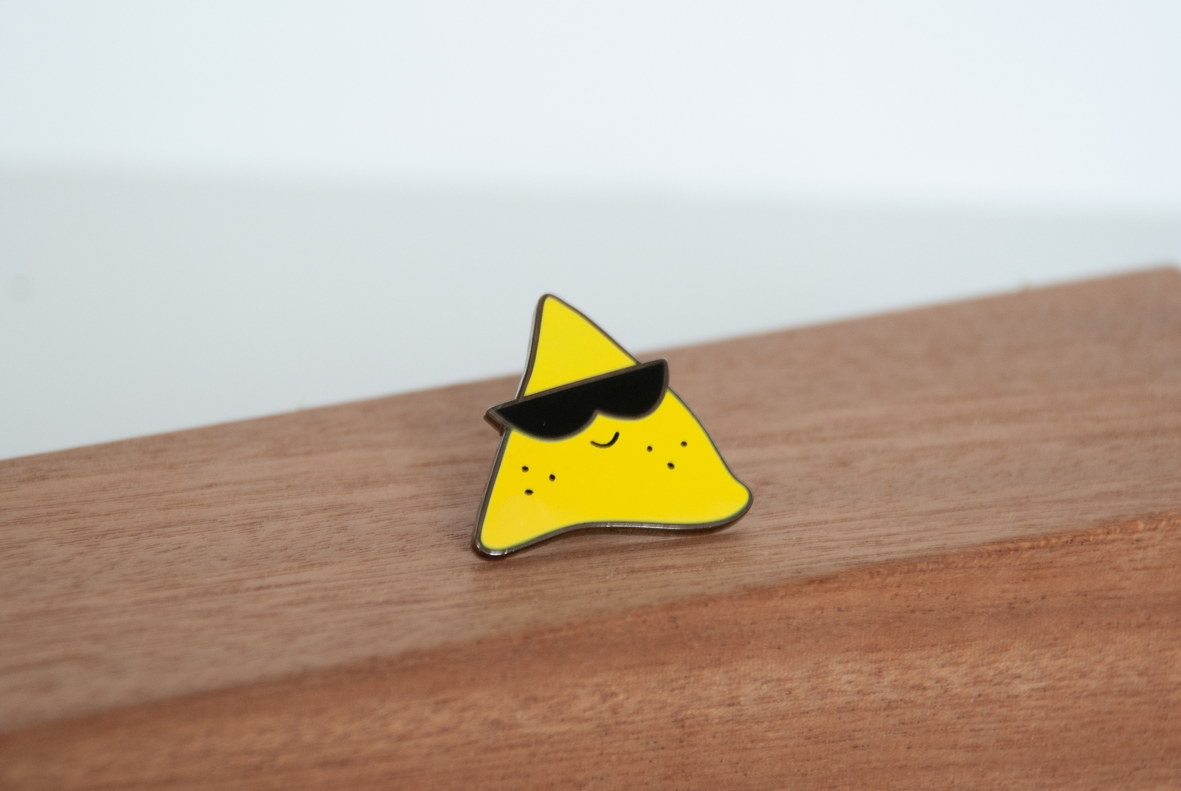
Nacho Problem is a sassy and fun company that focuses on marketing and content strategies for social media clients. The logo needed to be a nacho illustration, but also had to have a look of class and sass.
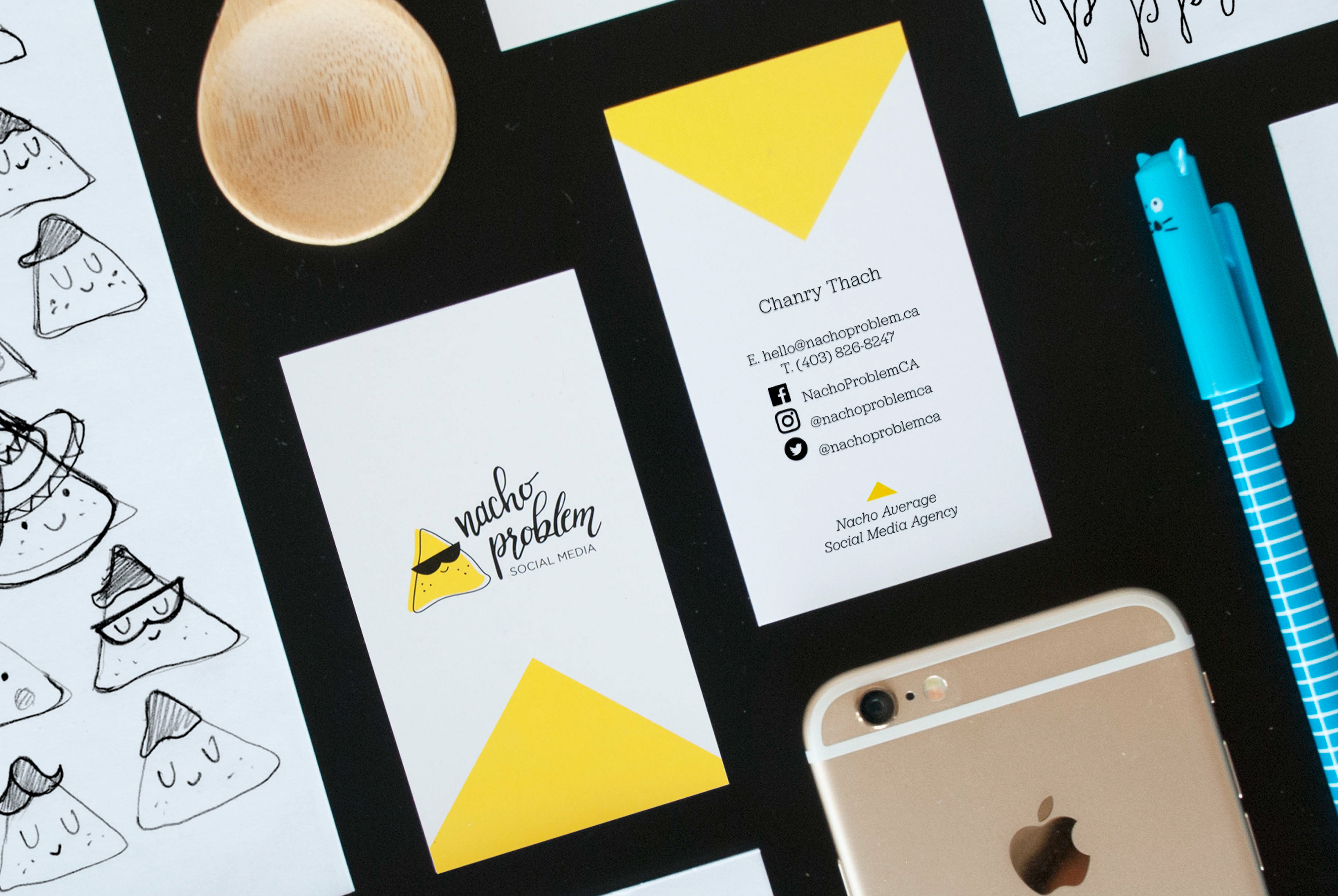
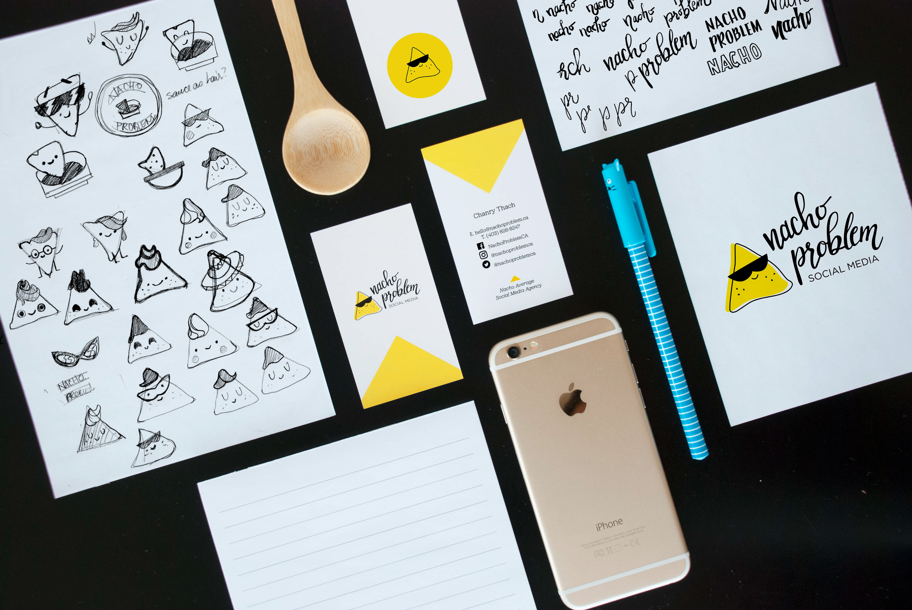
I explored the logo mark with various sketches, but the final one was picked for its minimal look and fun characteristic feel. Once the nacho was established, I wanted to explore hand lettering for the business name because it felt more organic much like the process of social media management. It just felt cohesive to use lettering that matched the nacho illustration style and brand. The business card had a lot of information to contain, so keeping it simple was the priority by using a repetition of a triangle and identity colour to tie everything together. We also created a custom hard enamel pin of the logo mark to give away to clients.