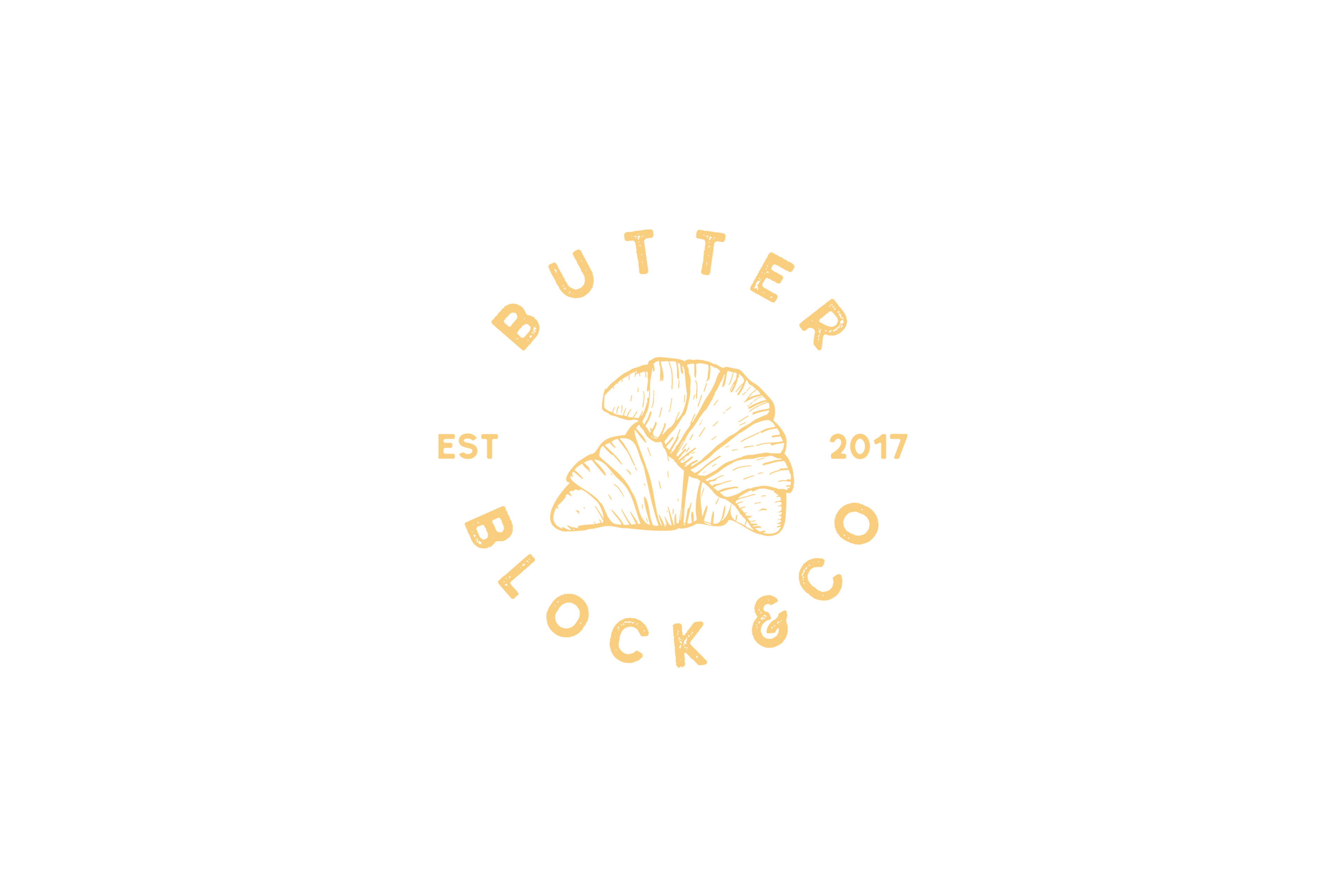
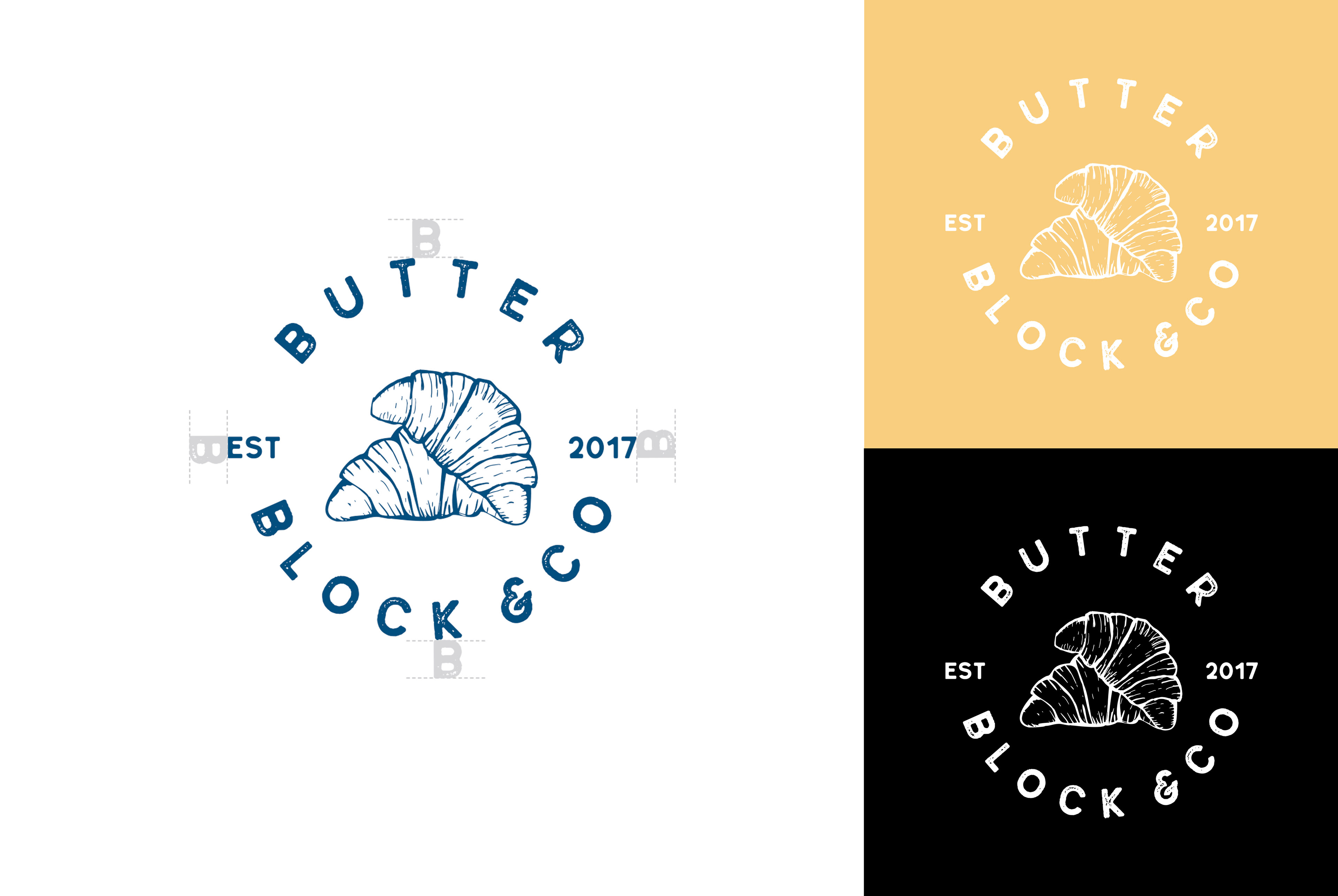
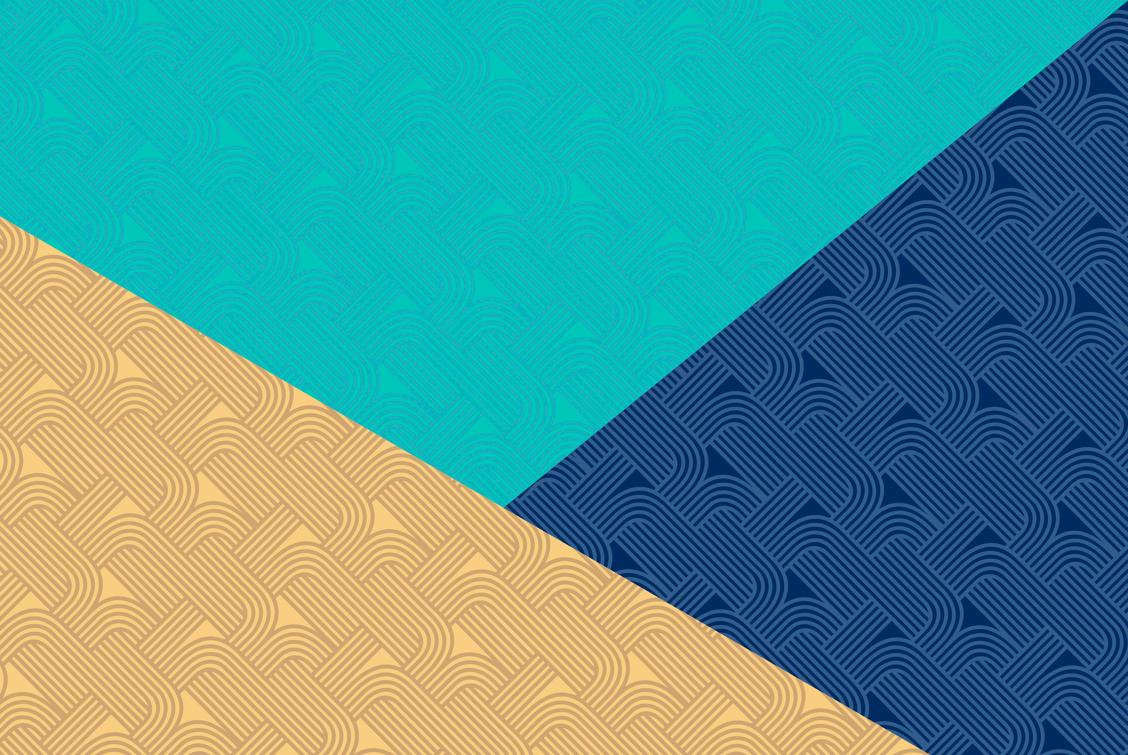
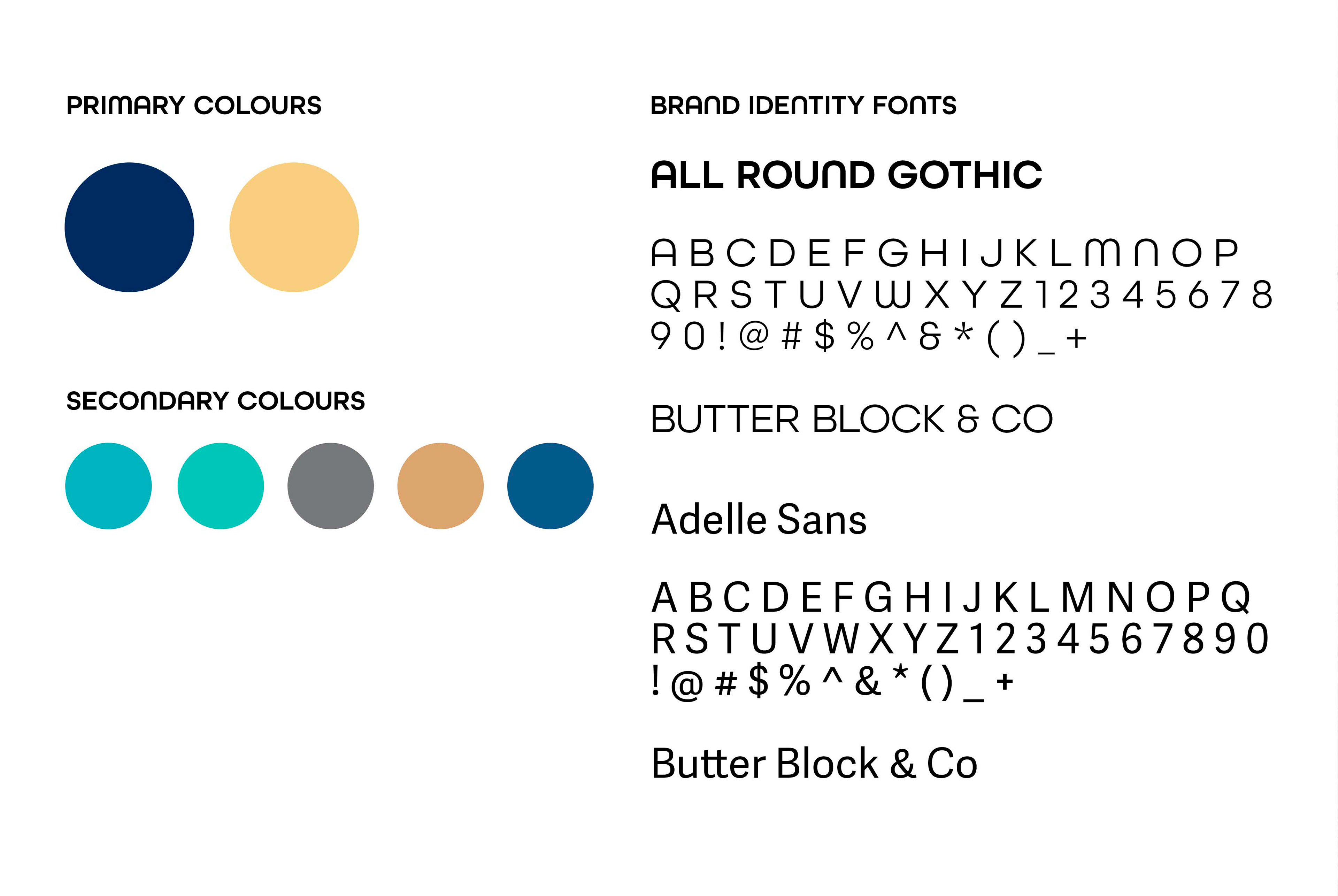
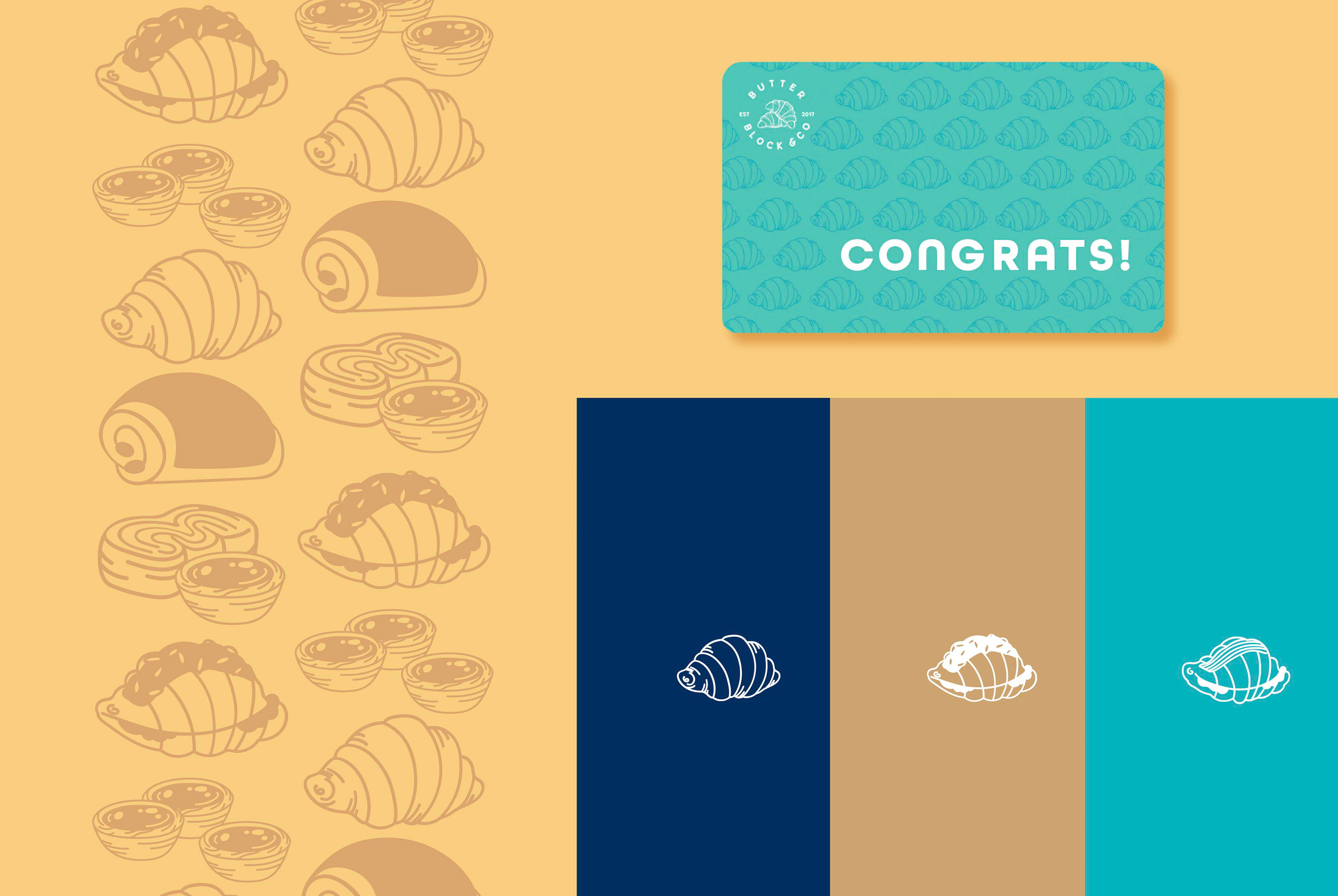
Butter Block & Co was looking to begin 2020 with a refresh of their brand that would be cohesive and help expand their extensive bakery offerings. The logo is already recognized in the community, so it was cleaned up and a new primary colour palette was created to brighten up the brand. Using those colours, a fun pattern was designed to complement the logo in marketing materials and emphasize the backbone of the bakery with their 81 layers of buttery pastry. Line illustrations of their pastries also add to the look and feel of the overall bakery identity. The brand refresh also gave us the opportunity to also update their website so they could re-launch their Squarespace site.